Mistakes in Science Communication — And How to Avoid Them
Why Clear Science Communication Matters
Even groundbreaking science can be misunderstood if it’s not communicated clearly. Investors, partners, or even scientists from other fields might struggle to follow your mechanism of action (MoA) if the visuals are vague or the text is too technical.
Take Merida Biosciences, for example. Their drug is designed to destroy autoantibodies—the ones that attack your own body and cause autoimmune diseases. It’s a smart and exciting approach.
We like their science. We like their visuals. But even great work can be easier to follow.
Let’s walk through 4 common mistakes in science communication—and how to fix them.
Mistake in Science Communication 1: Jargon-heavy language
Here’s a line from their website:
“Moreover, our therapeutics can inhibit B cells in an antigen-specific manner via agonism of FcγRIIB.”
Sounds impressive. But what does it actually mean?
- What is an “antigen-specific manner”?
- What does “agonism of FcγRIIB” imply?
If you’re speaking to immunologists, fine. But many stakeholders—like investors or business partners—won’t ask for clarification. They’ll just tune out.
How to avoid it:
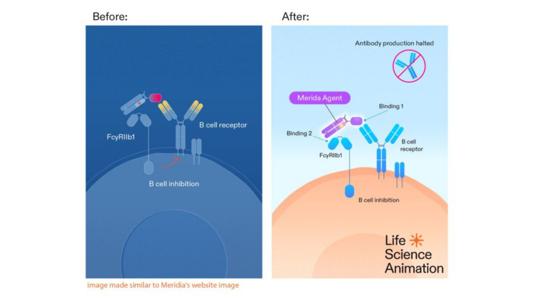
Explain it like it’s for beginners. Merida’s drug binds to disease-causing B cells (Binding 1), and activates an “off switch” (Binding 2), so they stop producing harmful antibodies.
Mistake in Science Communication 2: Unlabeled visuals
In the original image, you can’t tell which part is Merida’s drug. You also don’t see where Binding 1 and Binding 2 happen.
Why it matters:
If you’re highlighting your innovation, make sure it’s actually visible.
How to avoid it:
Label what you’re talking about. Make sure your audience can connect the dots between what they’re reading and what they’re seeing.
Mistake in Science Communication 3: The drug isn’t visible enough
In the original visual, everything looks like part of the same structure. There’s no clear “hero.”
Why it matters:
Your drug is the main character. It needs to stand out.
How to avoid it:
Make the drug easy to spot. Use a contrasting color. Give it a label. Separate it visually.
Mistake in Science Communication 4: The result isn’t clearly shown
You don’t really see what happens after the drug binds. The only visual cue is a small orange “T” for “B cell inhibition.”
Why it matters:
The audience needs to know what success looks like.
How to avoid it:
Show the effect. In our redesign, we added a simple icon to show: “antibody production halted.”
Before and After: A Visual Example
We took the original image and redesigned it using these four tips.
Left: Before (original)
Right: After (clearer communication)
Final Takeaway
Biotech science is complex. But your communication doesn’t have to be.
When you:
- simplify your language,
- label your visuals,
- highlight the hero (your drug), and
- show the outcome
you make it easier for everyone to understand your breakthrough.
And when people understand you, they get excited.
Want help turning your MoA into a visual story investors can follow? Let’s talk.